(Just in case you were still wondering, we’re really an independent design and advertising agency based in Singapore. Not a bakery.)
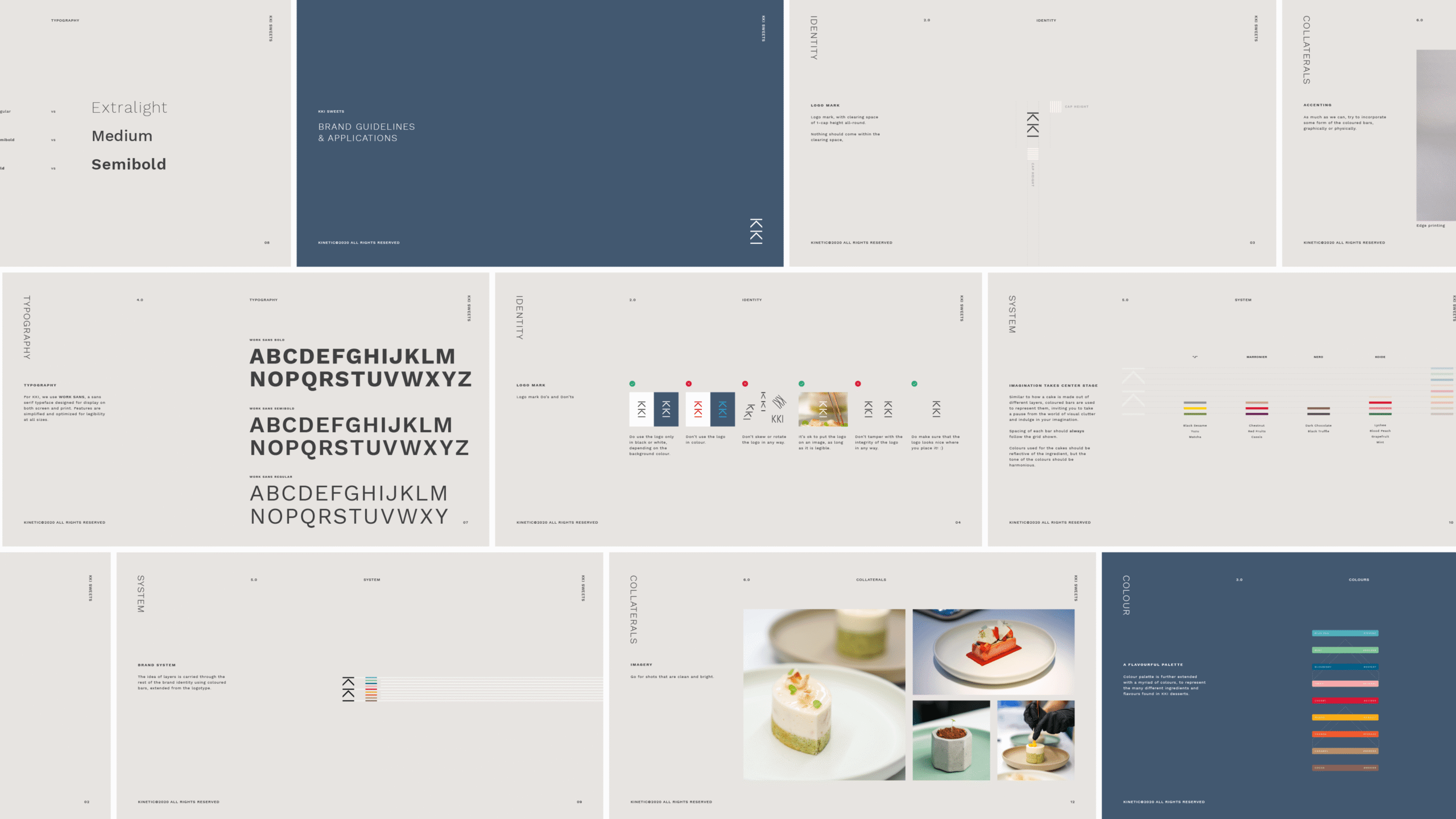
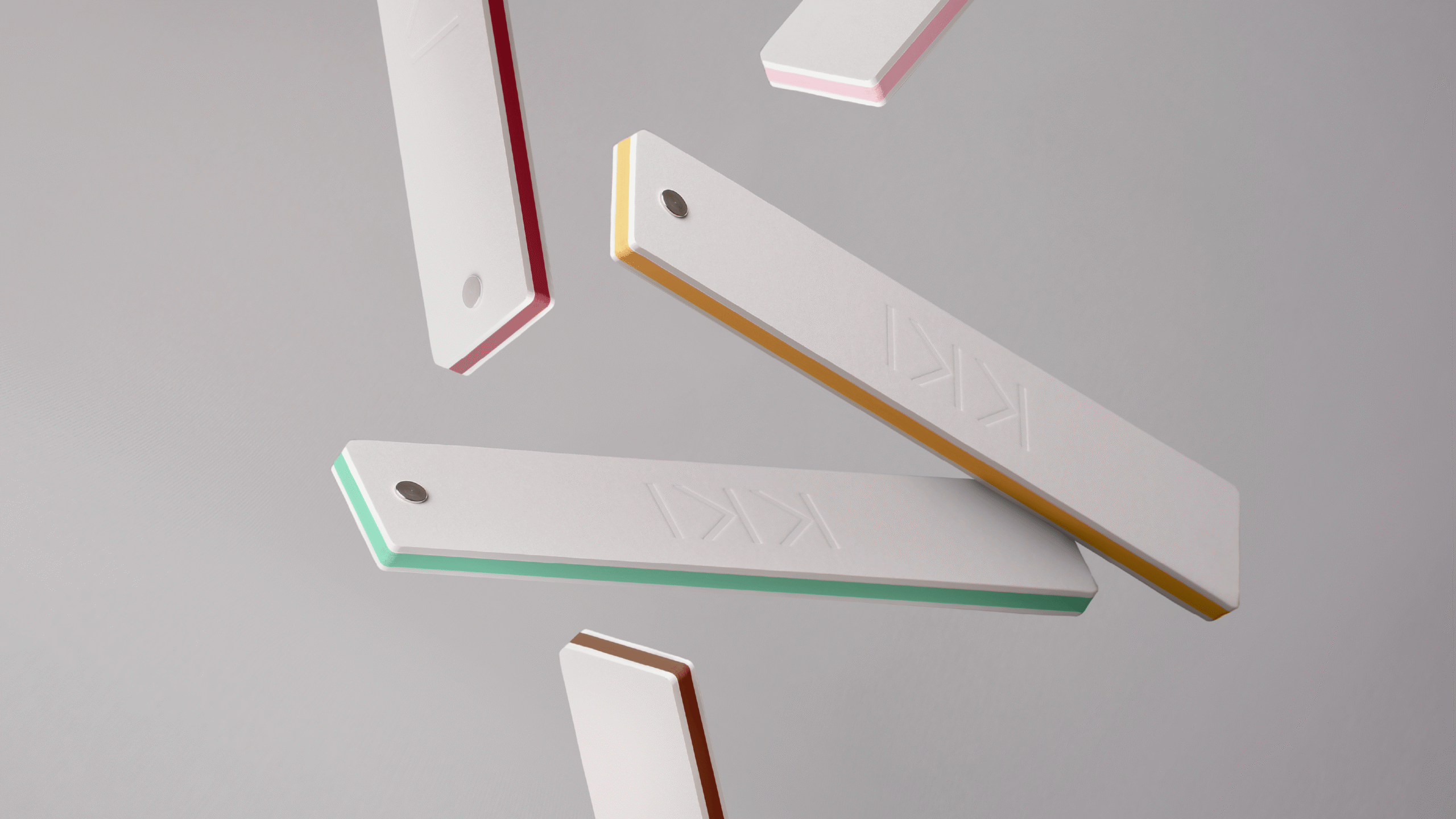
Every one of KKI’s elegant desserts is born from an astounding level of craft and creativity. So we developed a brand system of coloured bars that reflect the myriad layers of tastes, textures and thought in their creations.
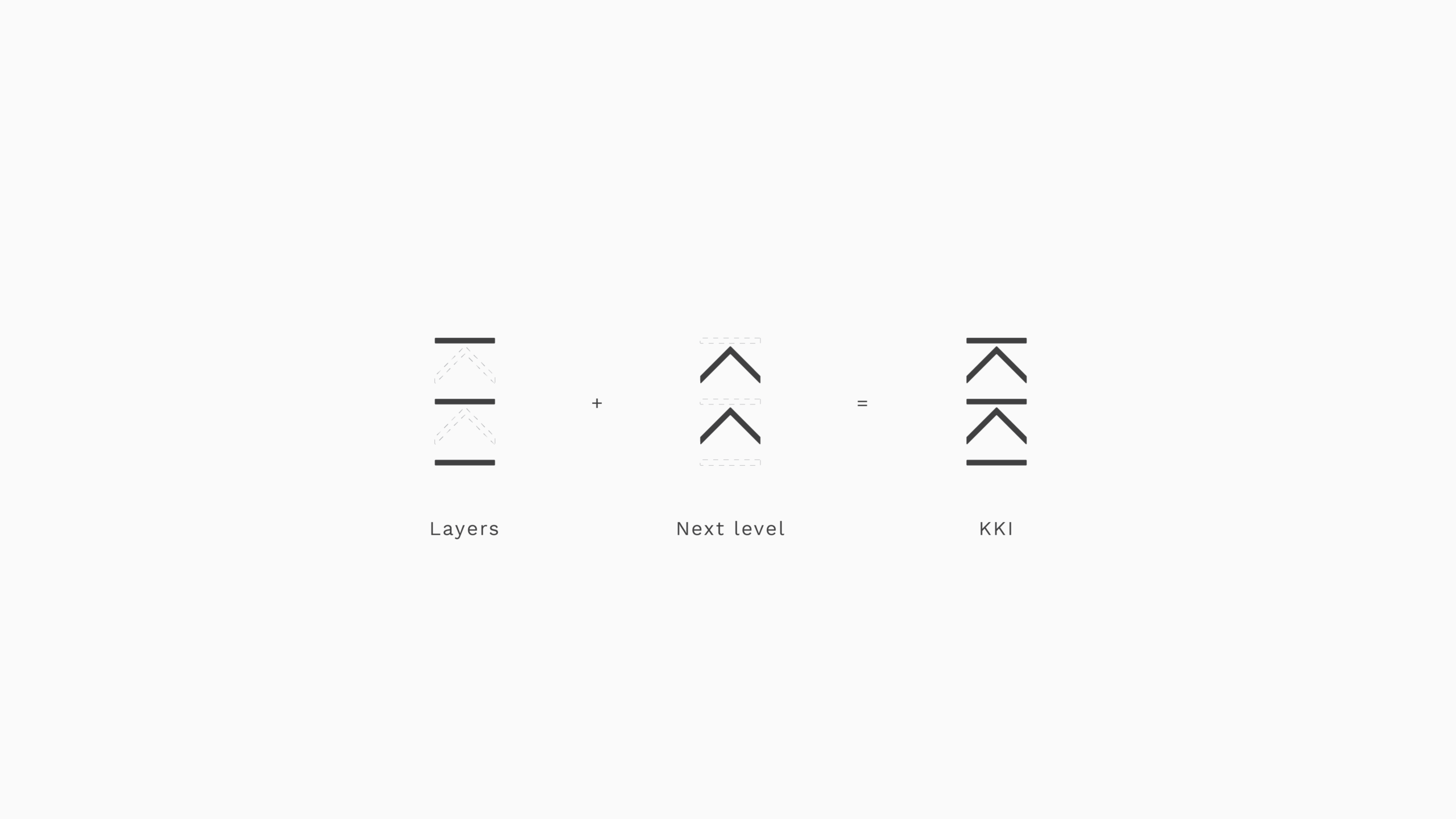
Similar to how a cake is made out of different layers, coloured bars are used to represent them, inviting you to take a pause from the world of visual clutter.
As each dessert is unique, every combination of coloured layers is different, reflecting the creation’s key ingredients for an individual flavour profile.
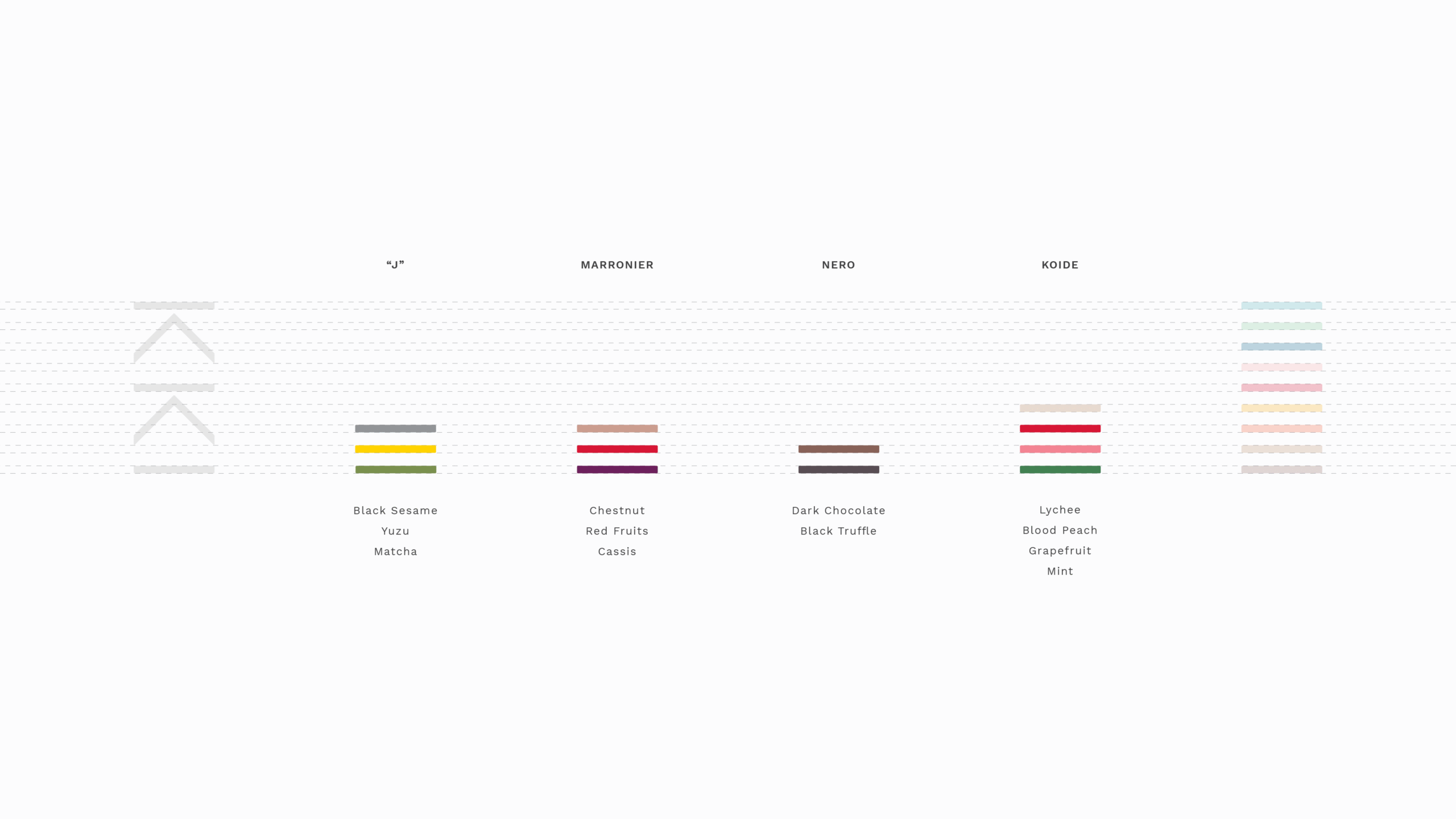
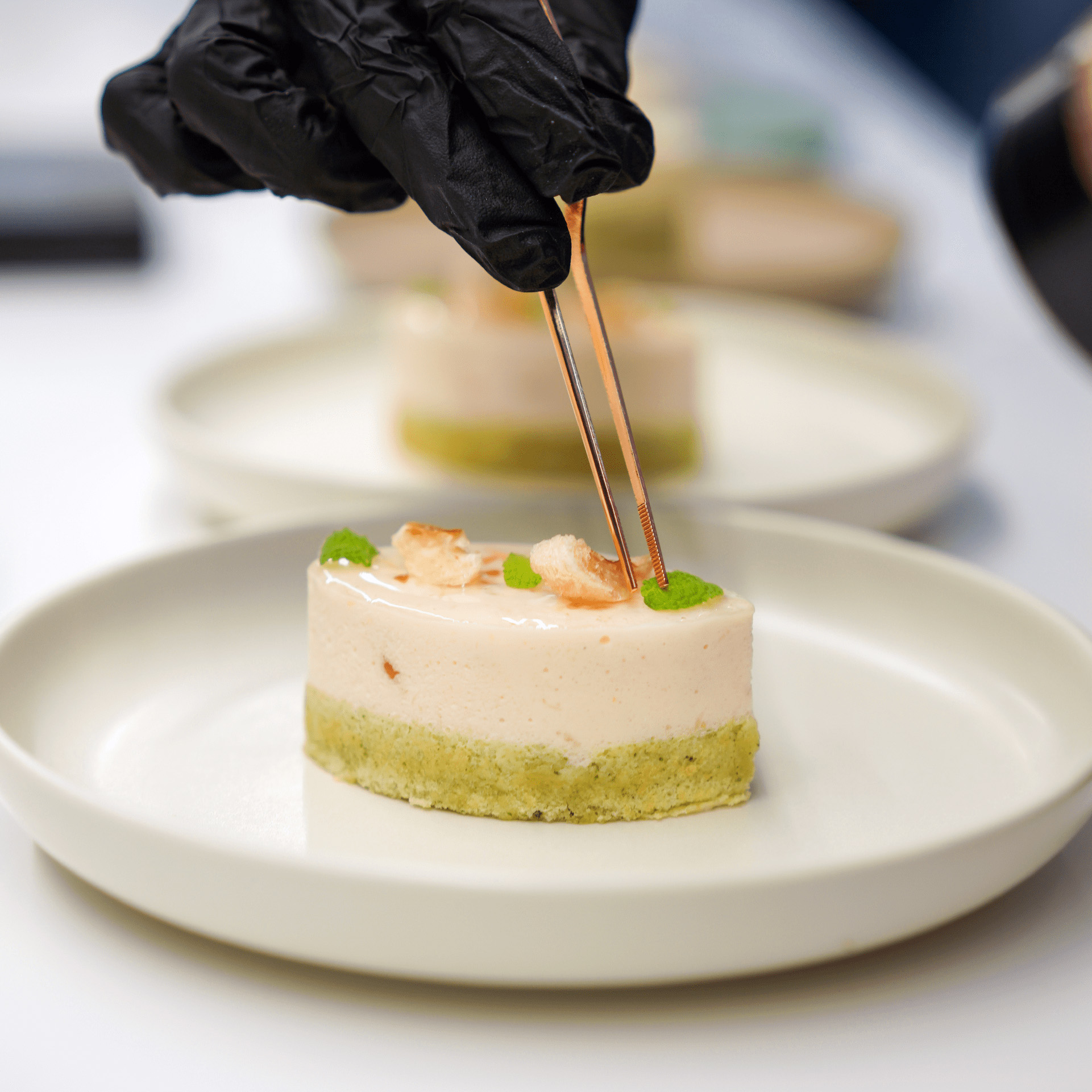
Instead of presenting photos of the desserts, the menu is presented as a colour swatch to stir the imagination of diners. Each of the coloured layers alludes to the key ingredients of each creation without giving away how it tastes and looks, which adds an element of suspense and surprise to the dining experience.
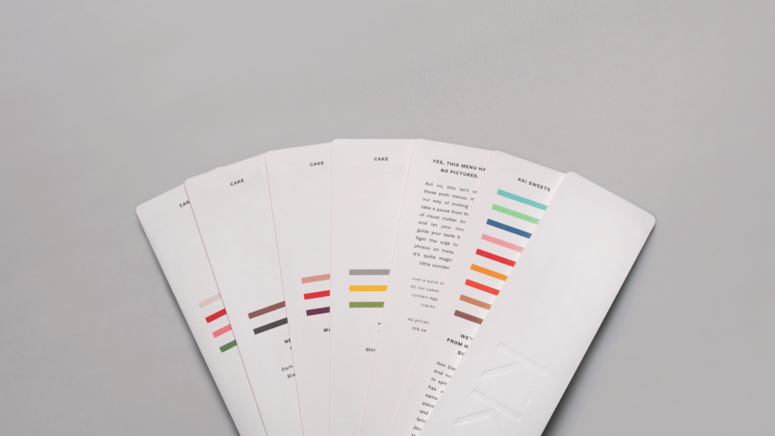
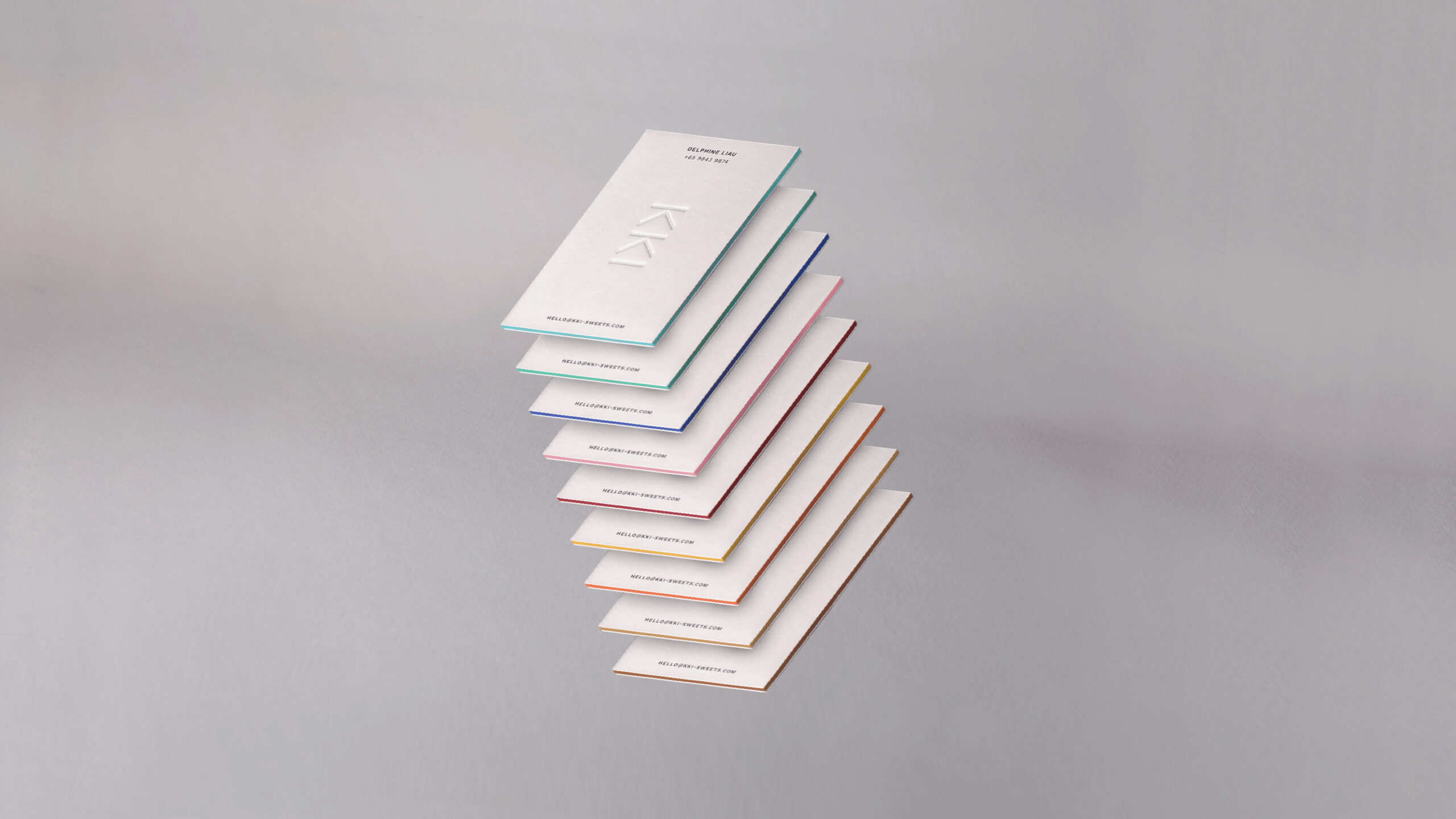
Edge printing is also used in the finish, making each menu a single colour bar ready to be layered with the rest.
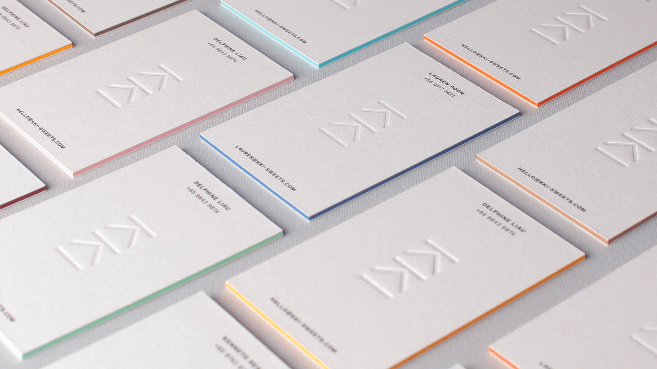
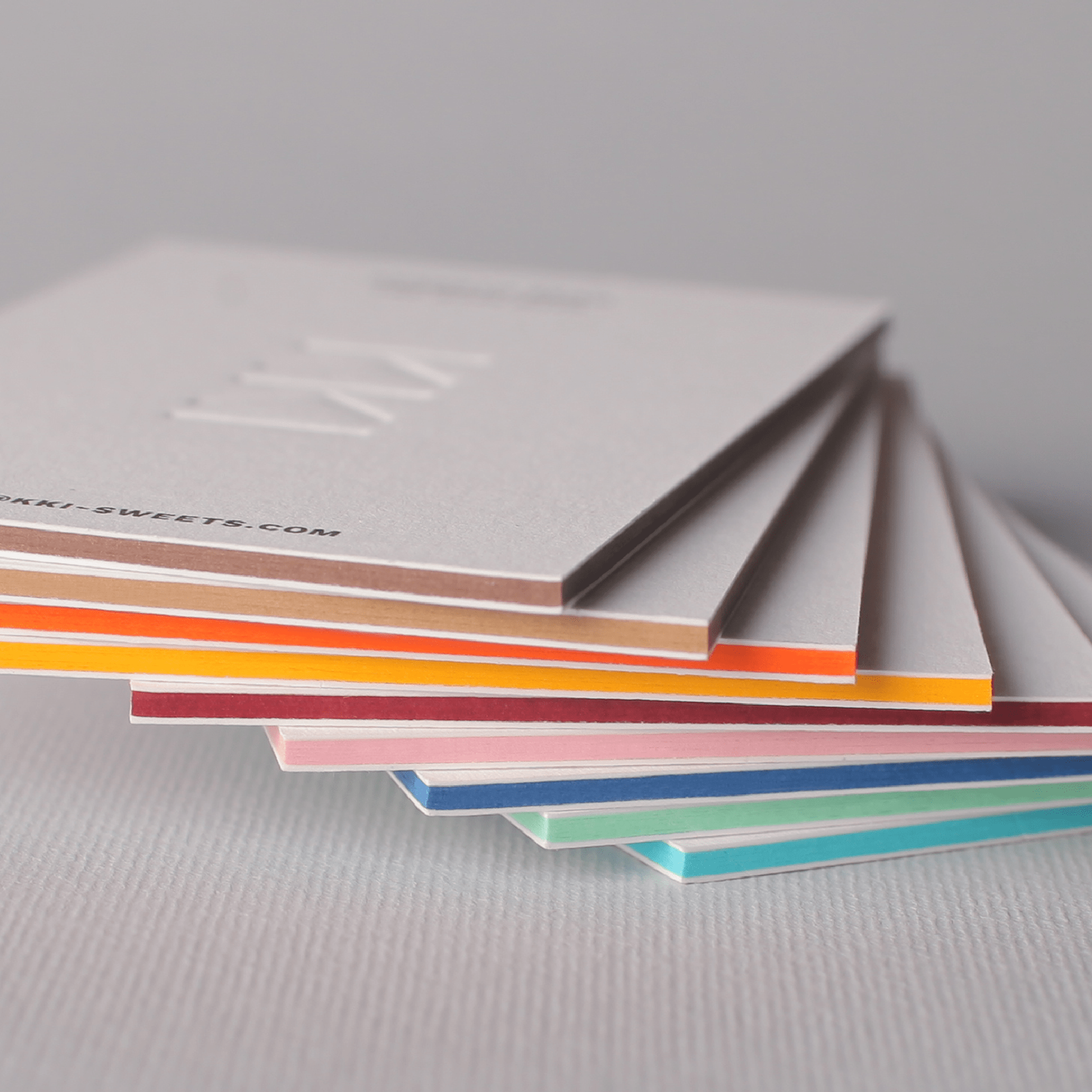
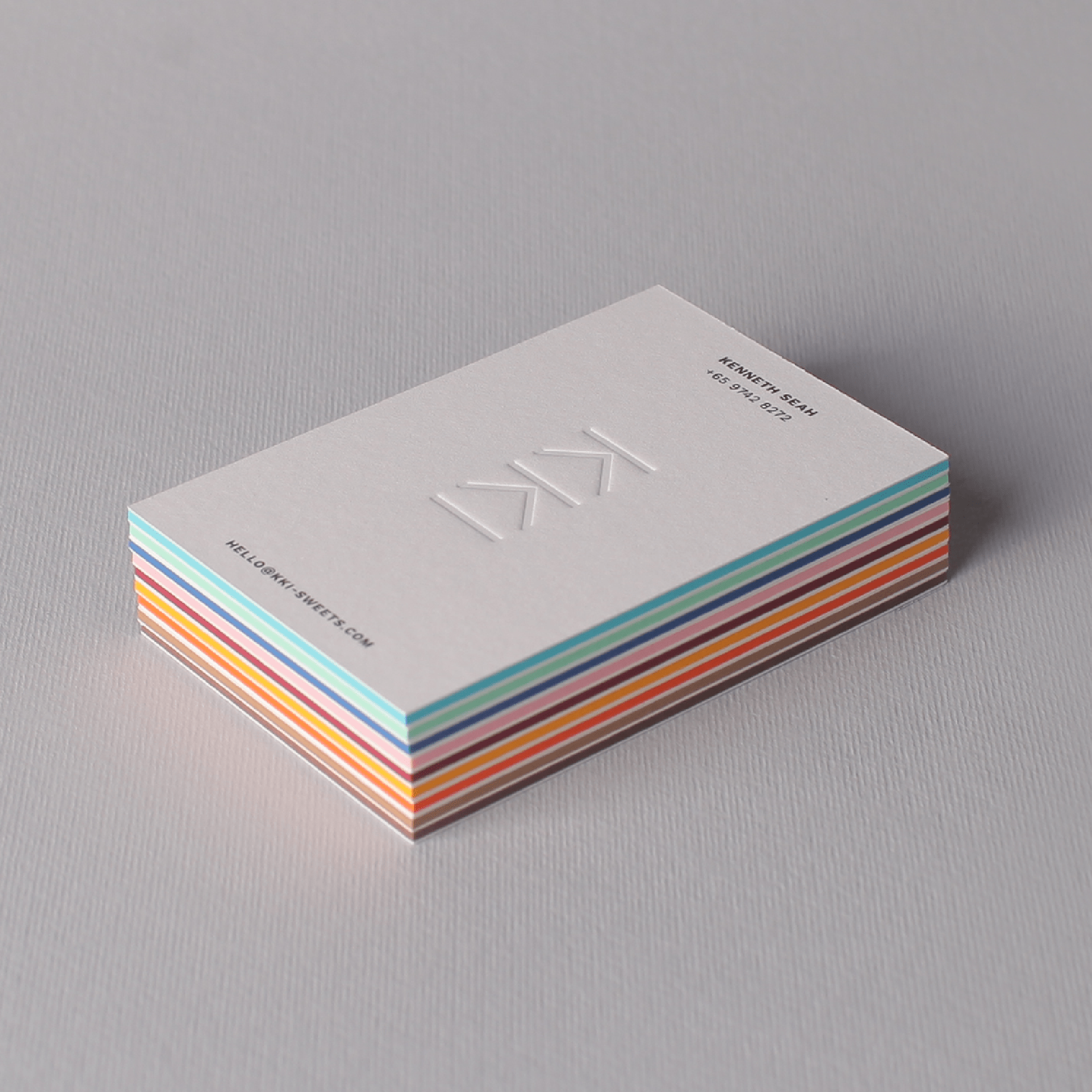
For a luxuriously layered feel in the name cards, the coloured bars were created by bonding 5 sheets of paper selected from G.F Smith’s Colorplan, a sustainable range with a mind-boggling colour selection.