(Just in case you were still wondering, we’re really an independent design and advertising agency based in Singapore. Not a bakery.)
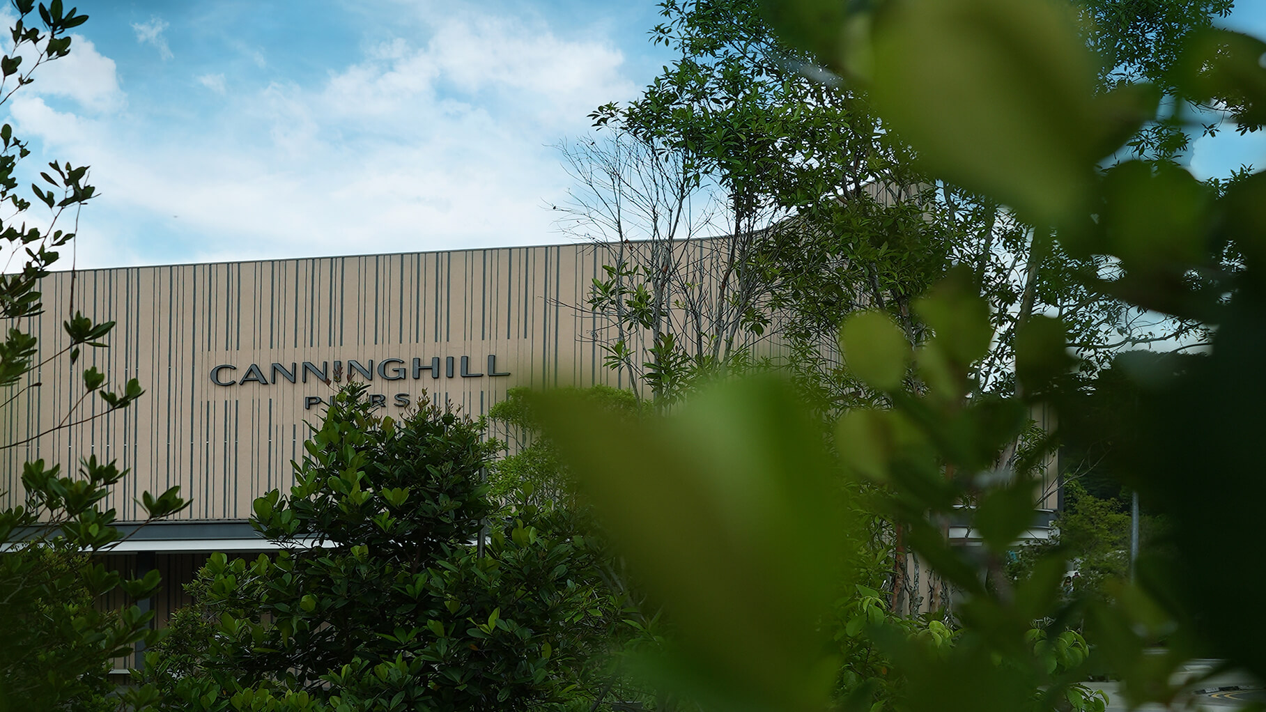
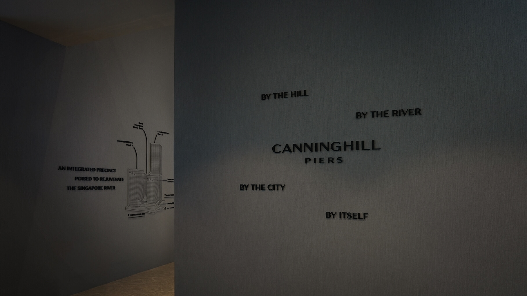
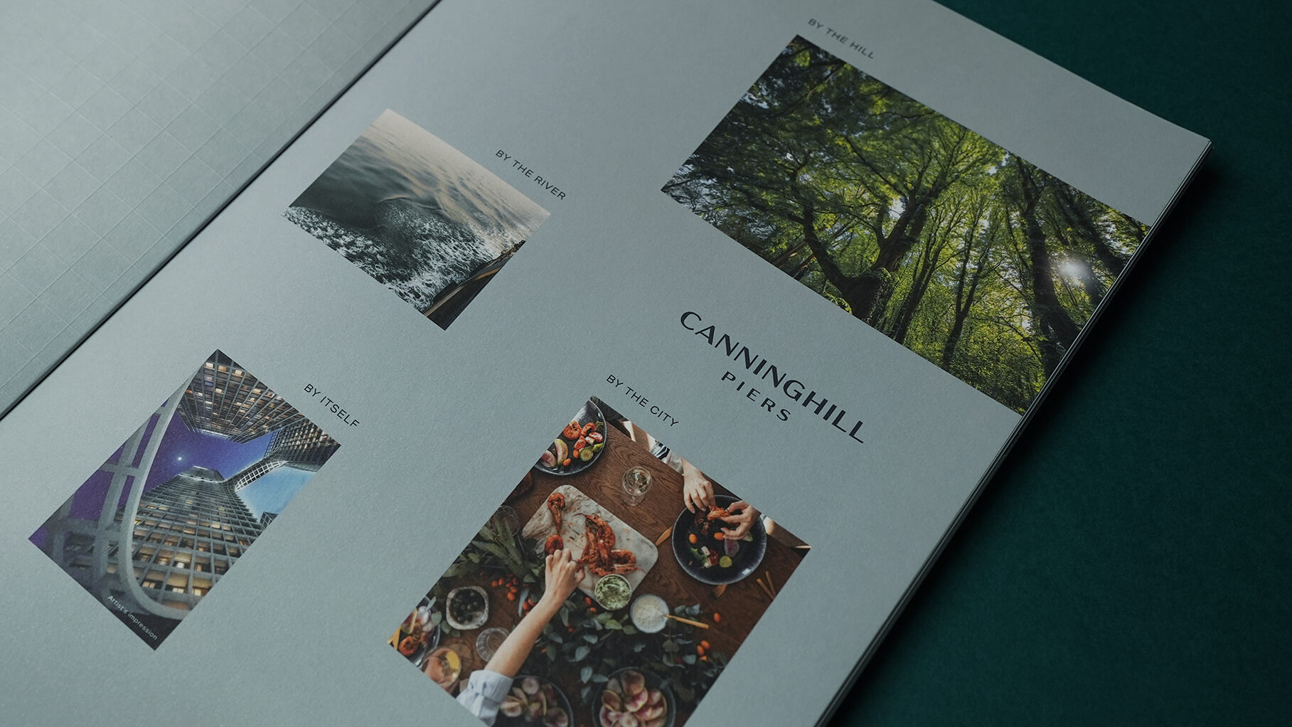
In Singapore’s highly competitive property market, “location, location, location” remains a key consideration when it comes to buying a home. And this new development by CDL and CapitaLand has it all: overlooking Singapore River on one side and Fort Canning Hill on the other, with all the conveniences of the city centre nearby too.
Identity Design
Our first task was to christen the development. We took inspiration from its one-of-a-kind location between hill and river to come up with the name CanningHill Piers.
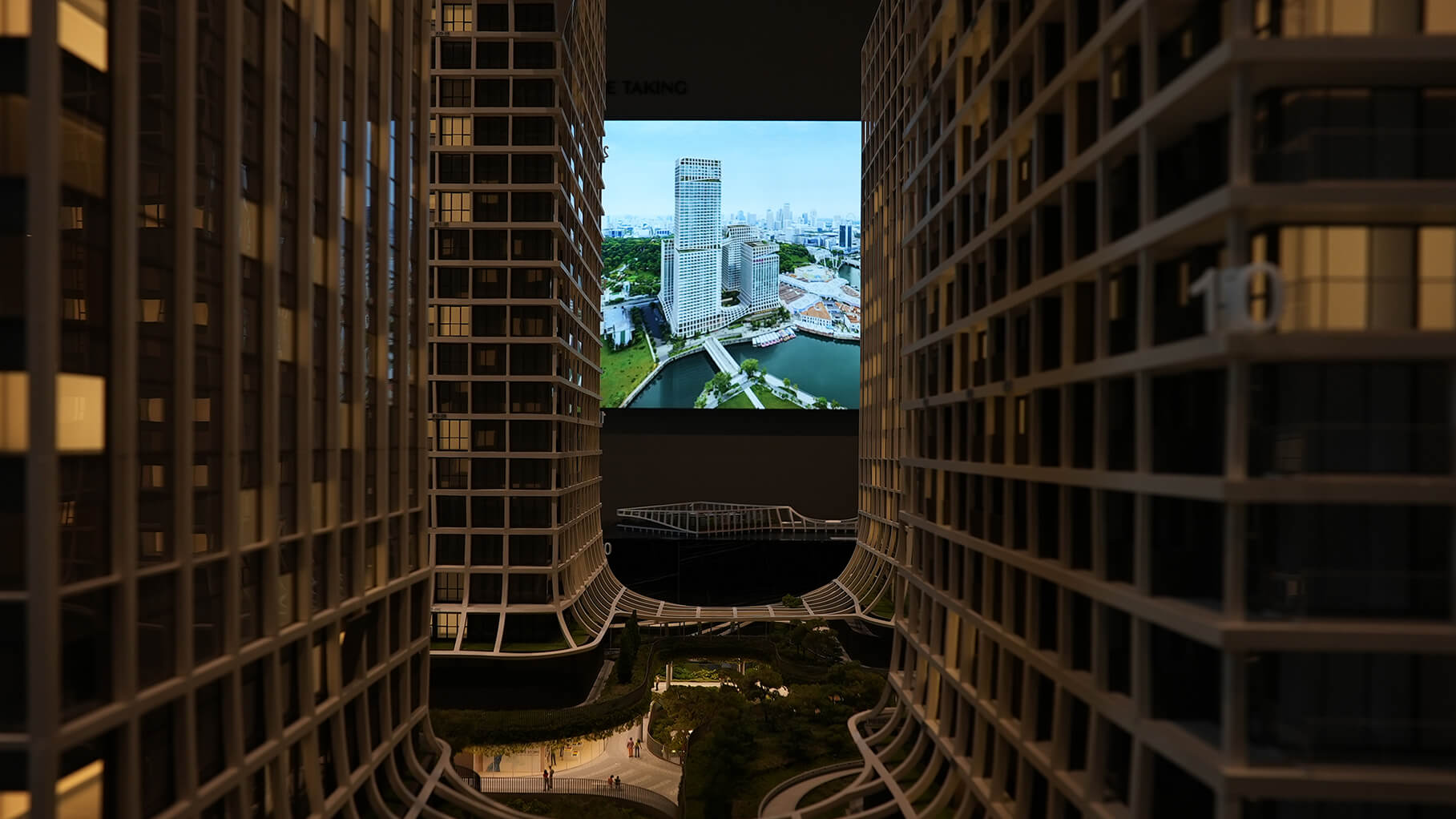
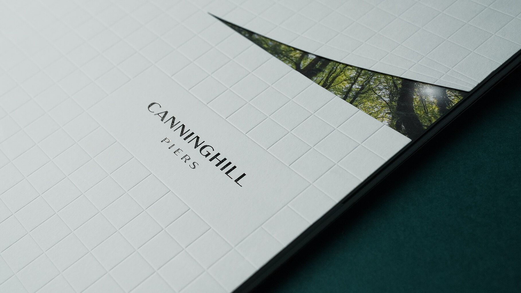
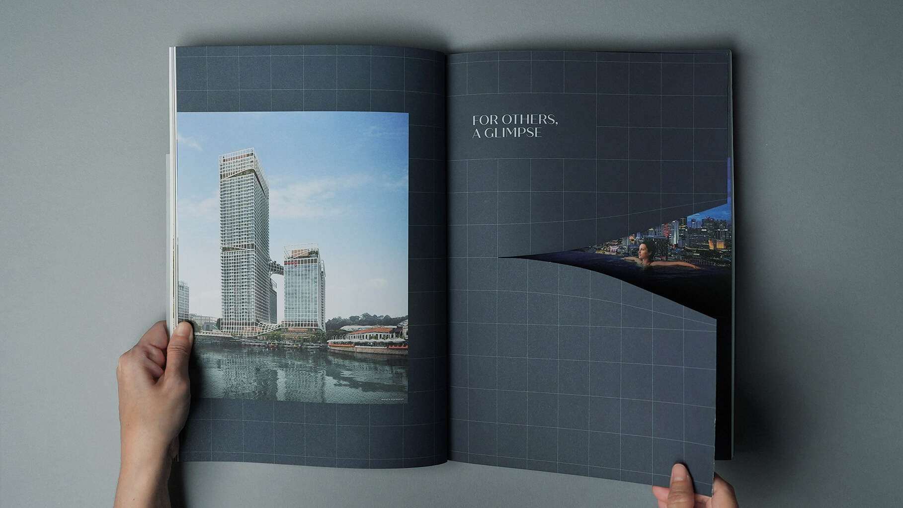
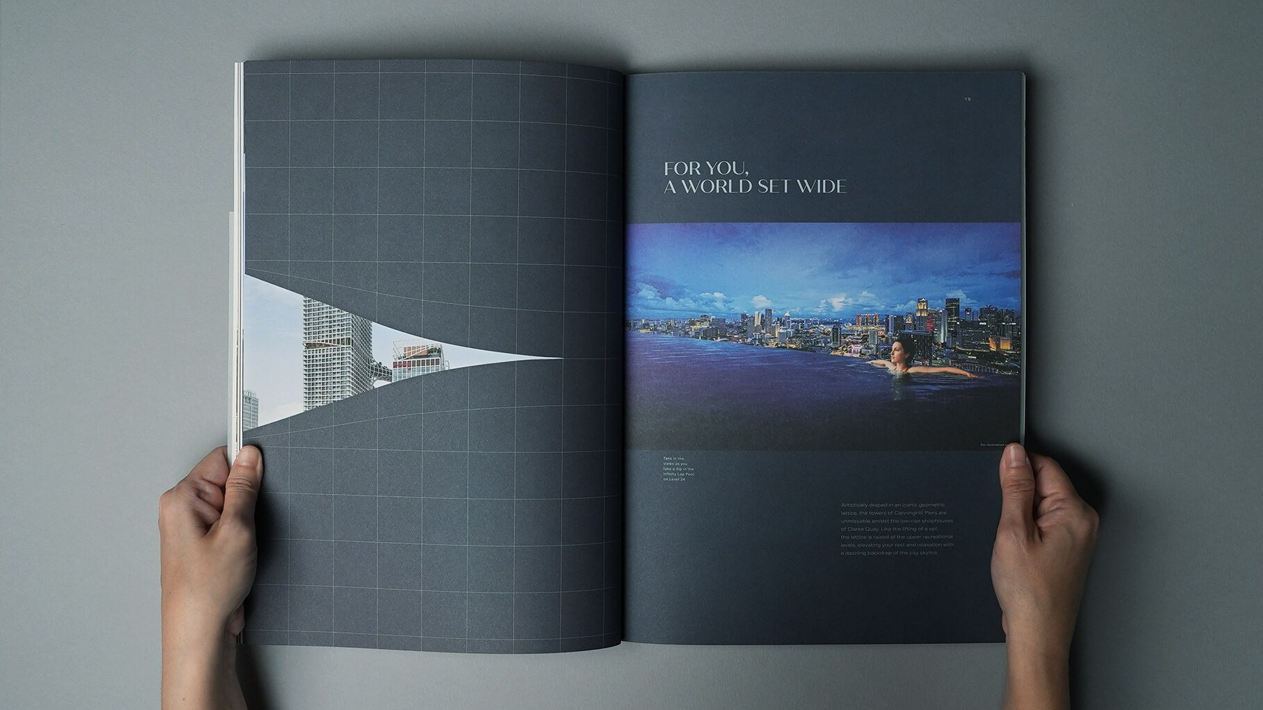
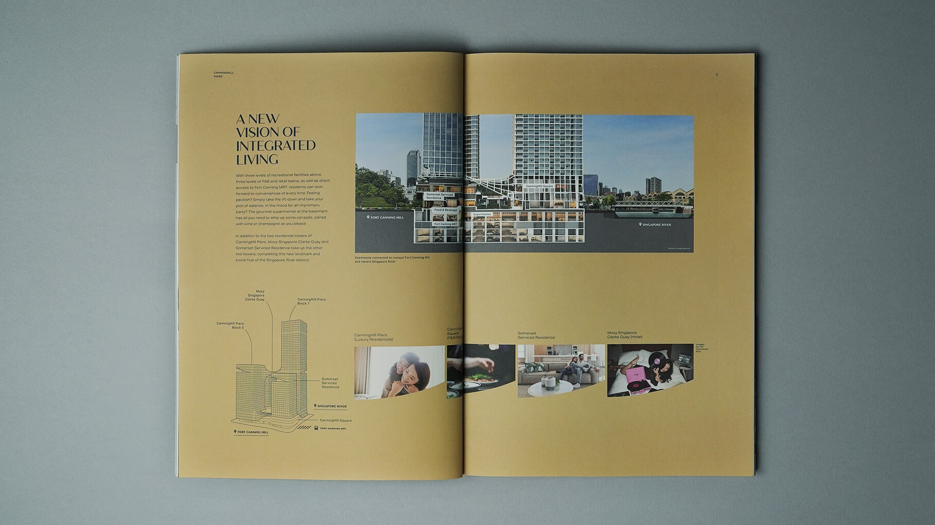
Another iconic aspect of the development is its geometric lattice ‘veil’ — raised at strategic points to allow onlookers a glimpse of what’s within while widening the vistas from the residents’ point of view — a distinctive architectural feature which we turned into a design motif. This motif is used extensively in the brochures as well as in other collaterals.
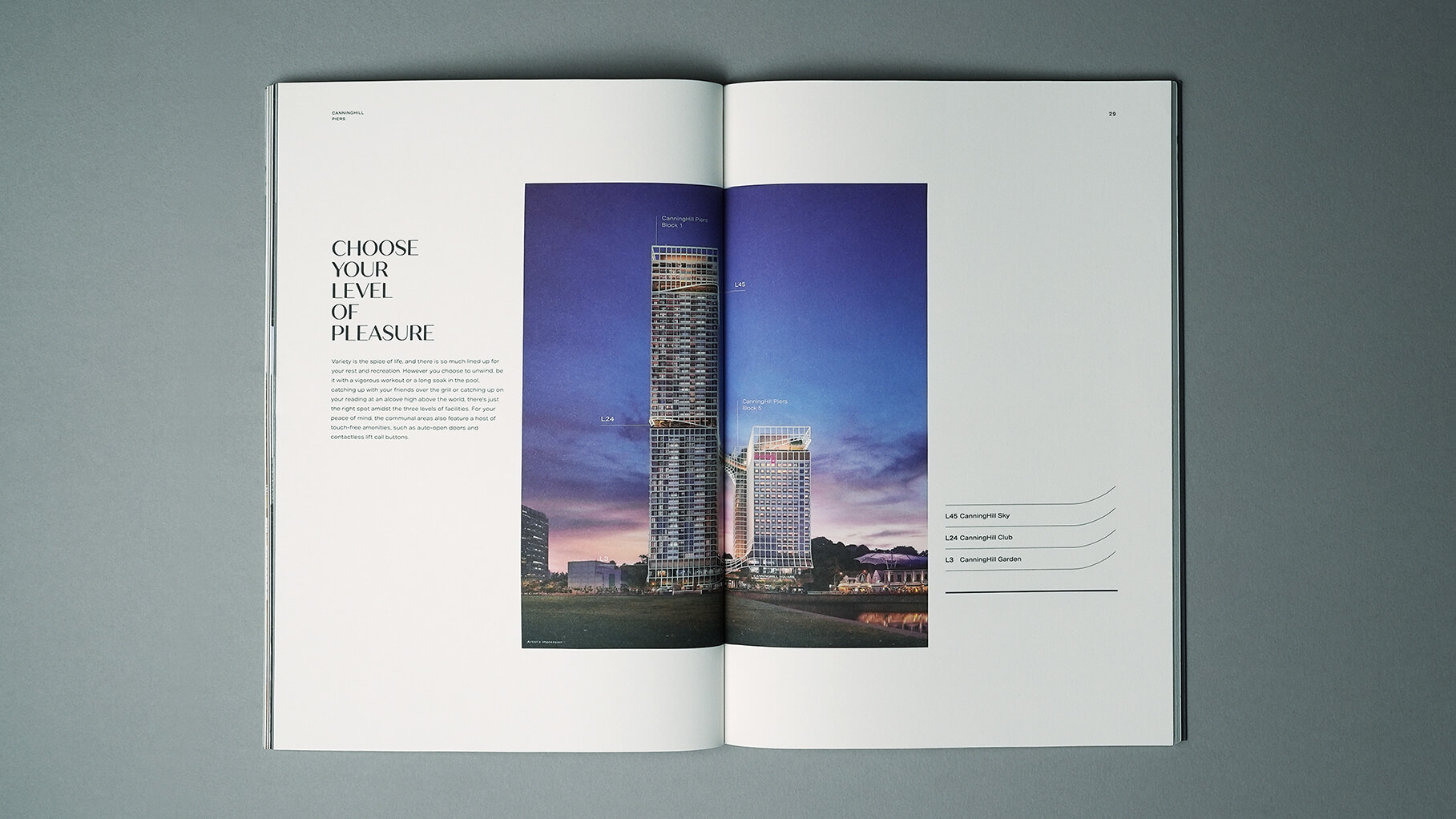
Brochure
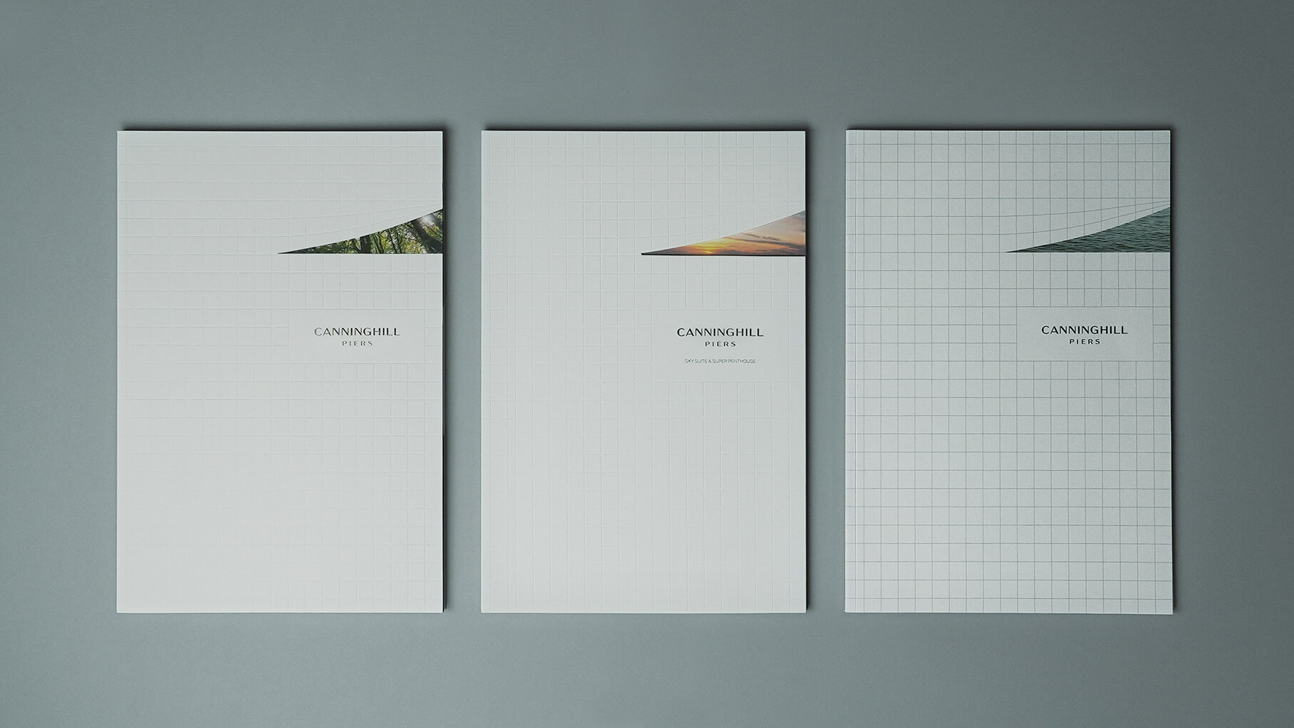
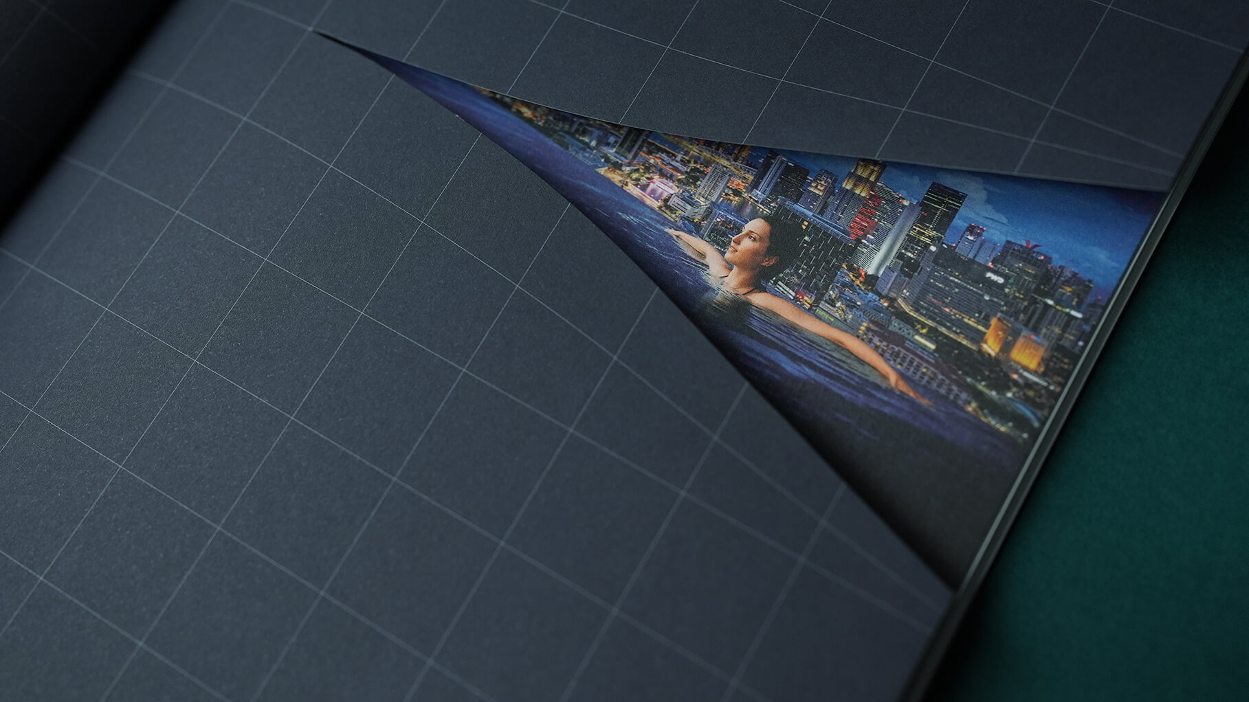
Three versions of brochure were created for different purposes and audiences. The cover design for these is almost identical except for the image at the portion where the ‘veil’ is raised.
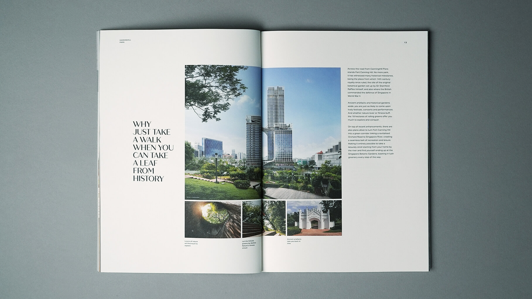
Full brochure: revealing greenery, like the views over Fort Canning Hill
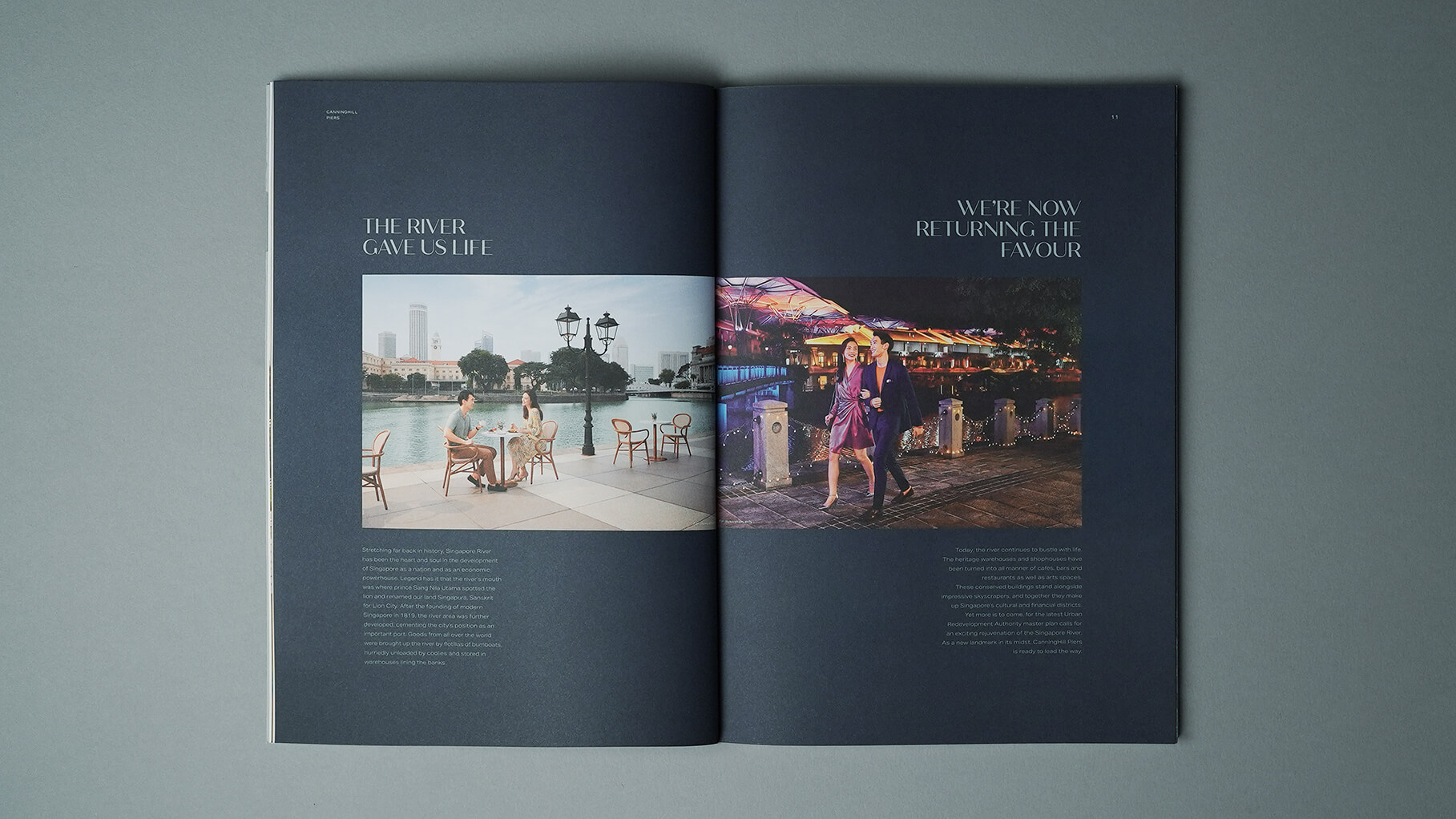
Simplified brochure: revealing waters, like those of Singapore River
Penthouse brochure: revealing views high up in the sky, as is apt for these exclusive units located on the uppermost floors
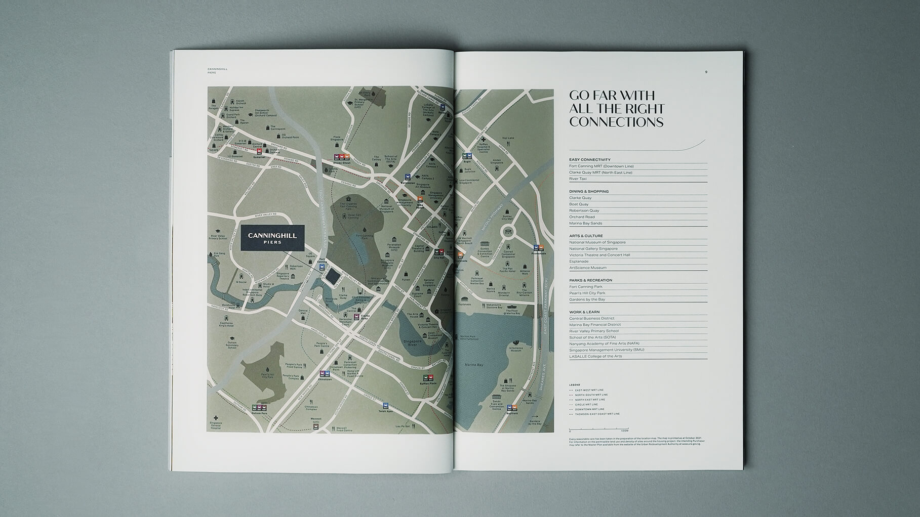
Digital Trail Map
Complementing the conventional map found in the brochure, we came up with a trail map to show the audience just how exciting the locale is. Covering the immediate vicinity of Clarke Quay, Boat Quay and Robertson Quay, it also features what to do/see/eat/shop in neighouring hoods like the Civic District and Tiong Bahru.
Video
We developed a total of three videos to better showcase the development’s myriad offerings. In the marketing video, which was also aired as a TV commercial, we sought to capture the heart of the audience with a charming spot, showing the good life that awaits at CanningHill Piers.
The follow-up introduction video elaborates on our claim to the good life by laying out all the benefits in a tangible way. The location video further details all the amenities and conveniences to be enjoyed nearby.
Press
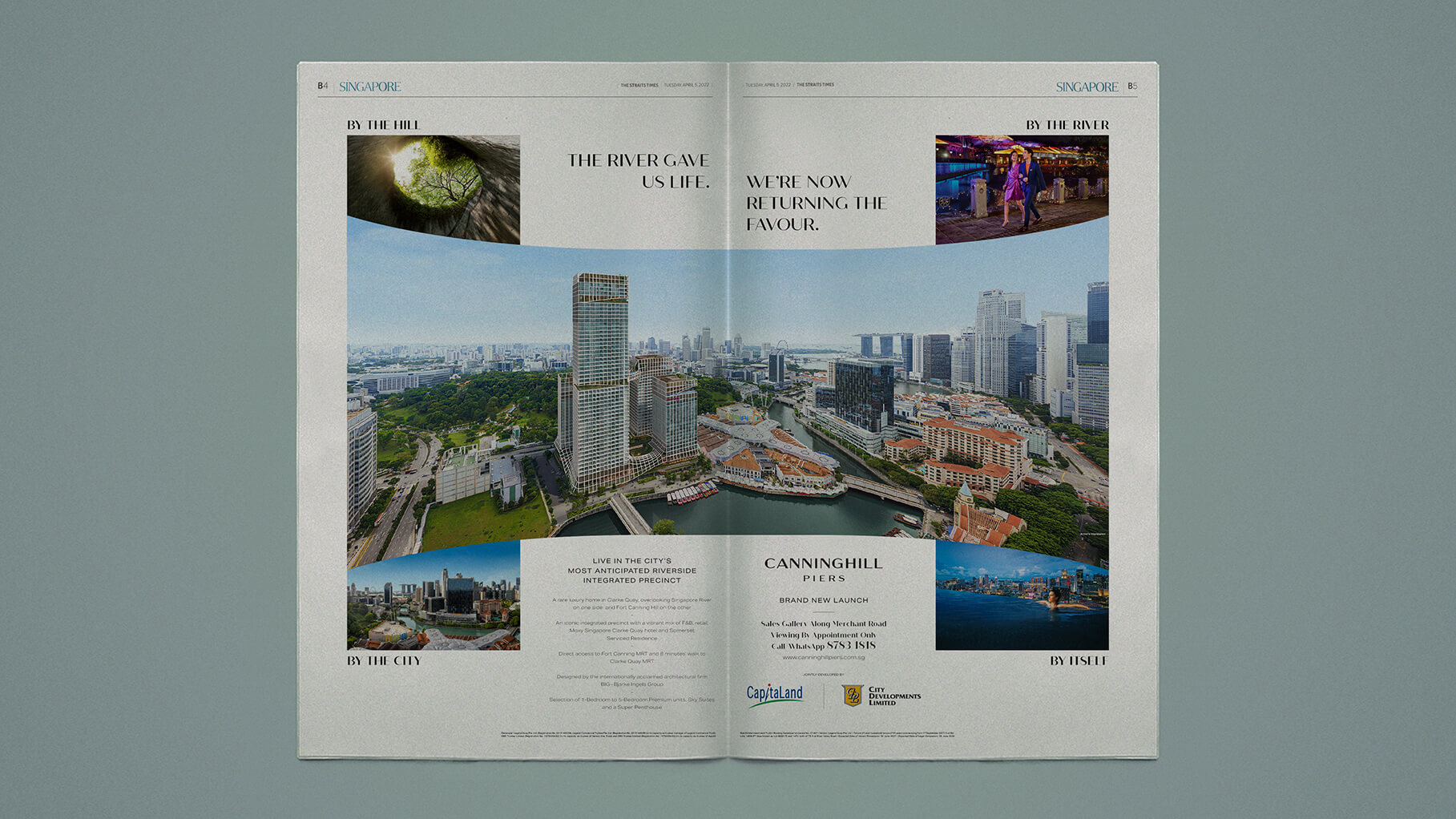
As is fitting for one of the most highly anticipated developments of 2021, CanningHill Piers was launched with a double-page spread, with a bold headline that asserts its leading position. This was supported by a series of single-page ads over the subsequent weeks.
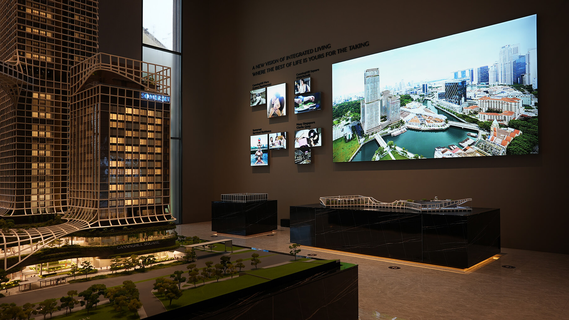
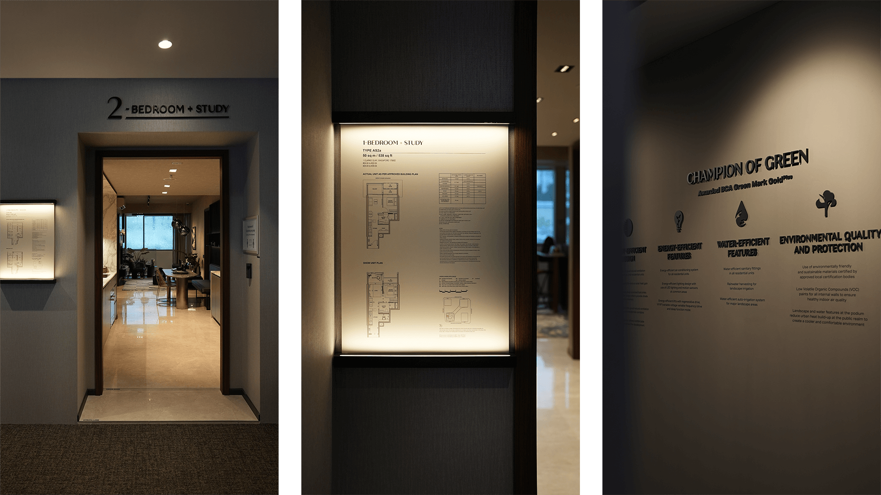
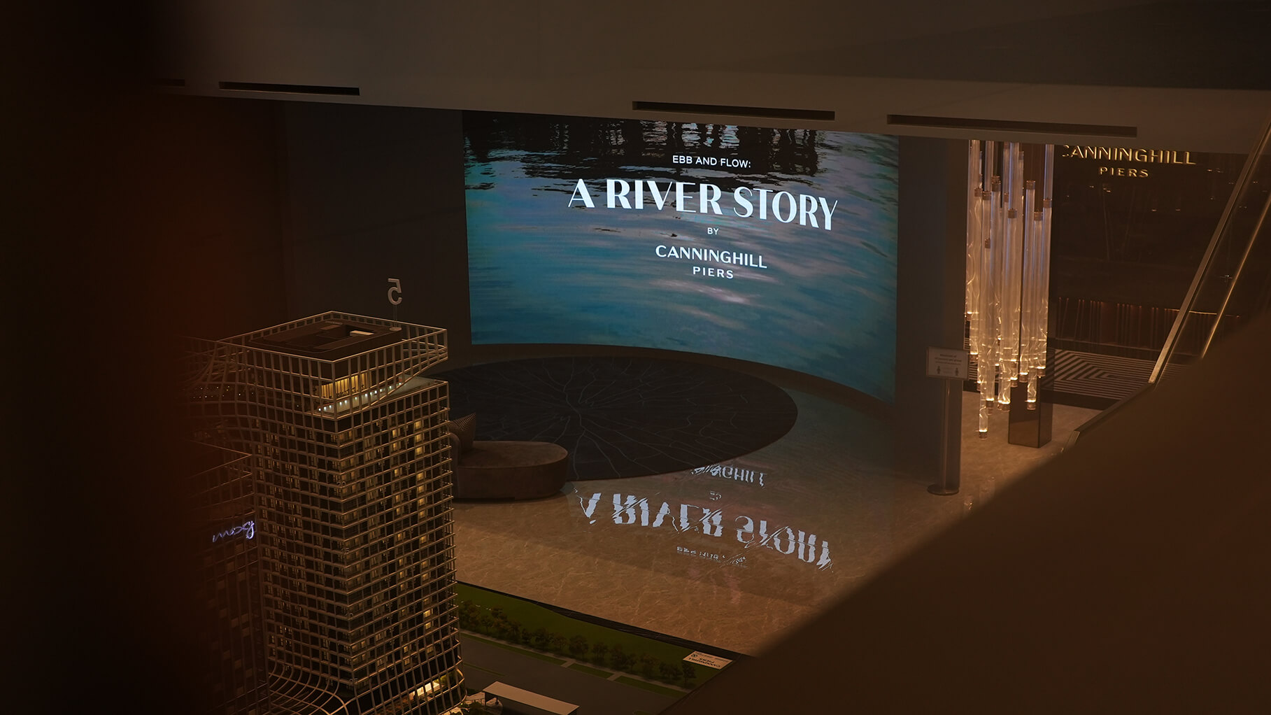
Sales Gallery
We were also brought in to work on the sales gallery, to ensure consistency across the campaign. This included the messaging and design of key sections where visitors are first introduced to the development, as well as supporting informational graphics throughout.