Frustrated by the lack of healthy yet yummy snack options, our client, a fitness enthusiast and lover of sweet treats, wanted to create a brand that delivers wholesomeness in a delectable and fun way.
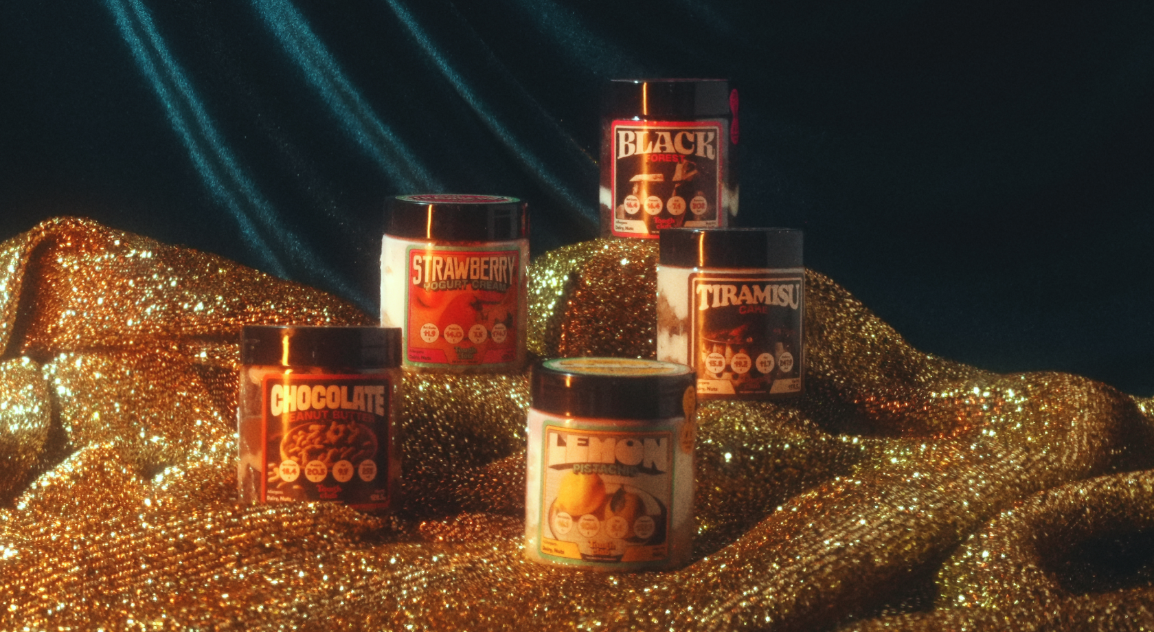
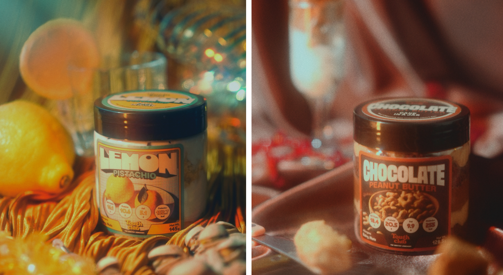
We were thus tasked to develop a brand identity for their snack shop that reflected this ethos. So we made sure to cook up something befitting its bodacious personality by referencing a time of boldness and energetic positivity – the high-octane 80s! The result? We served a sweet suite of deliverables from logo design to jar-sized packaging and collaterals, all with a big dose of cheeky.

Packaging
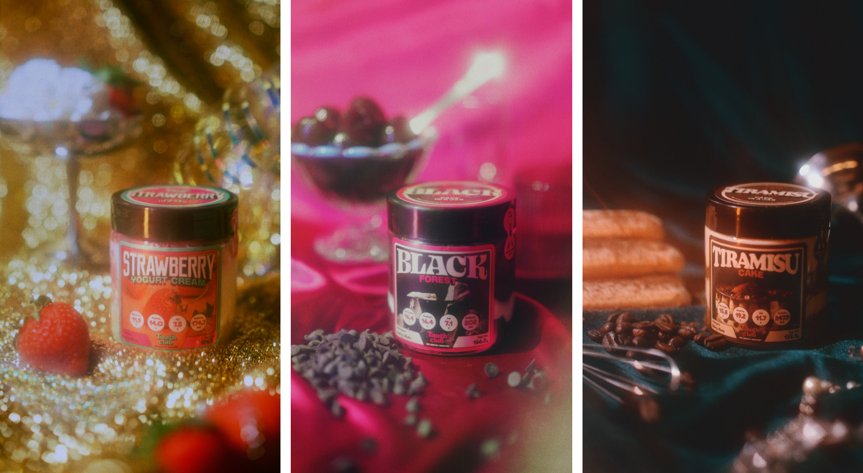
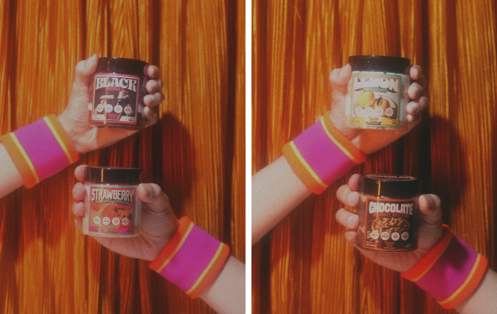
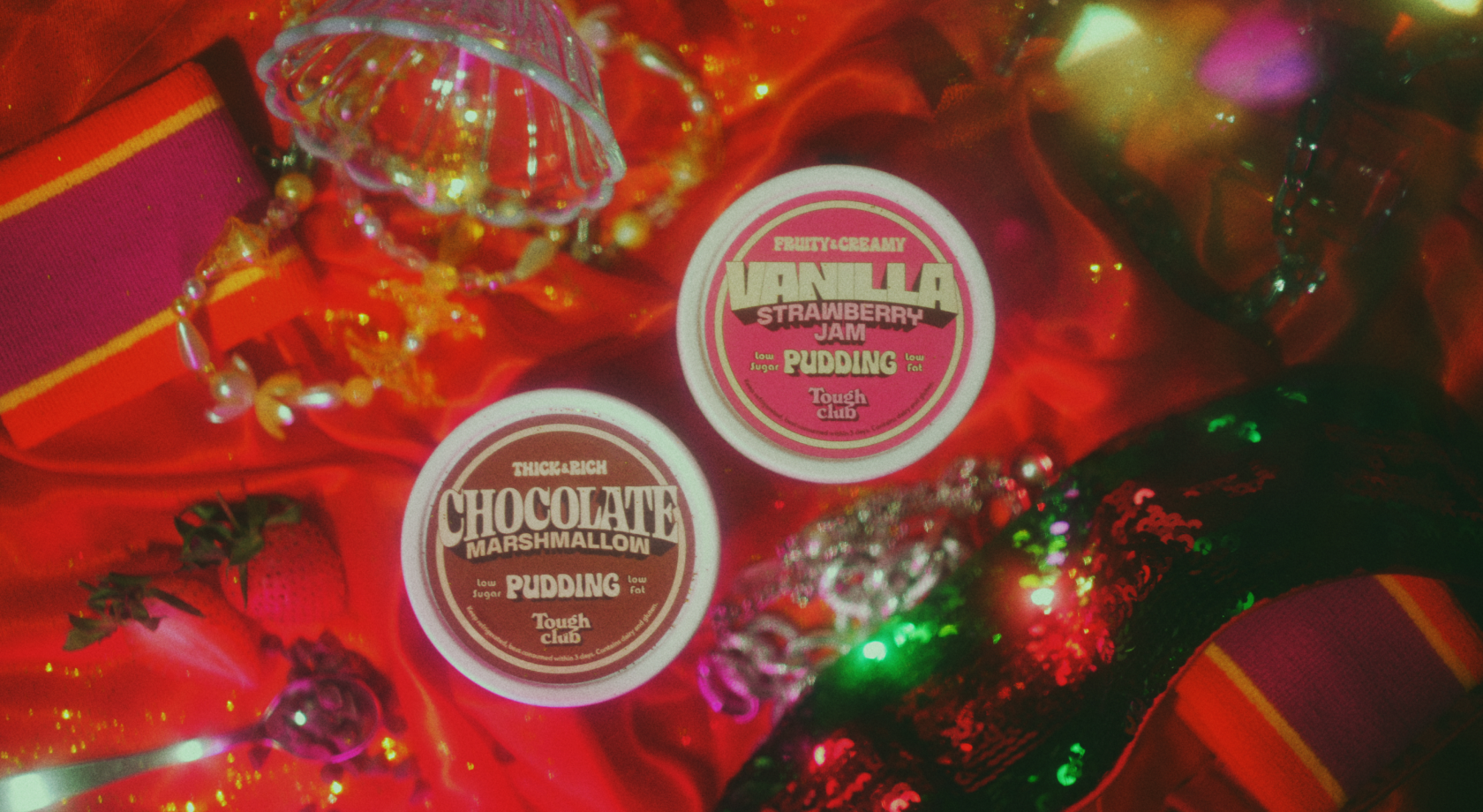
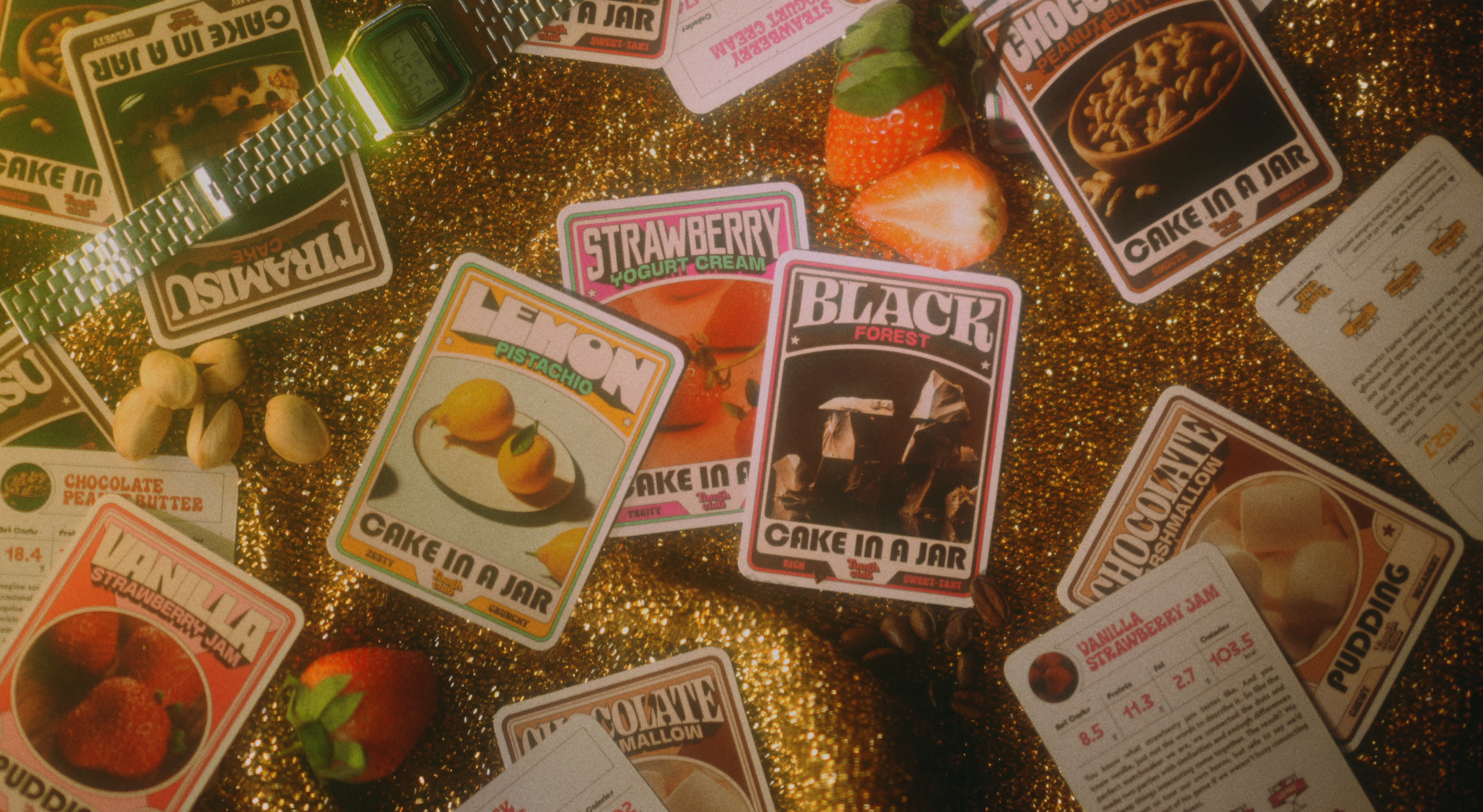
To start off, we gave each Cake In A Jar a unique 80s dressing, complete with custom type treatment and colours that exude the personality of each flavour. The freshness seal also came with a literal 80s “twist”!
The 80s Craze
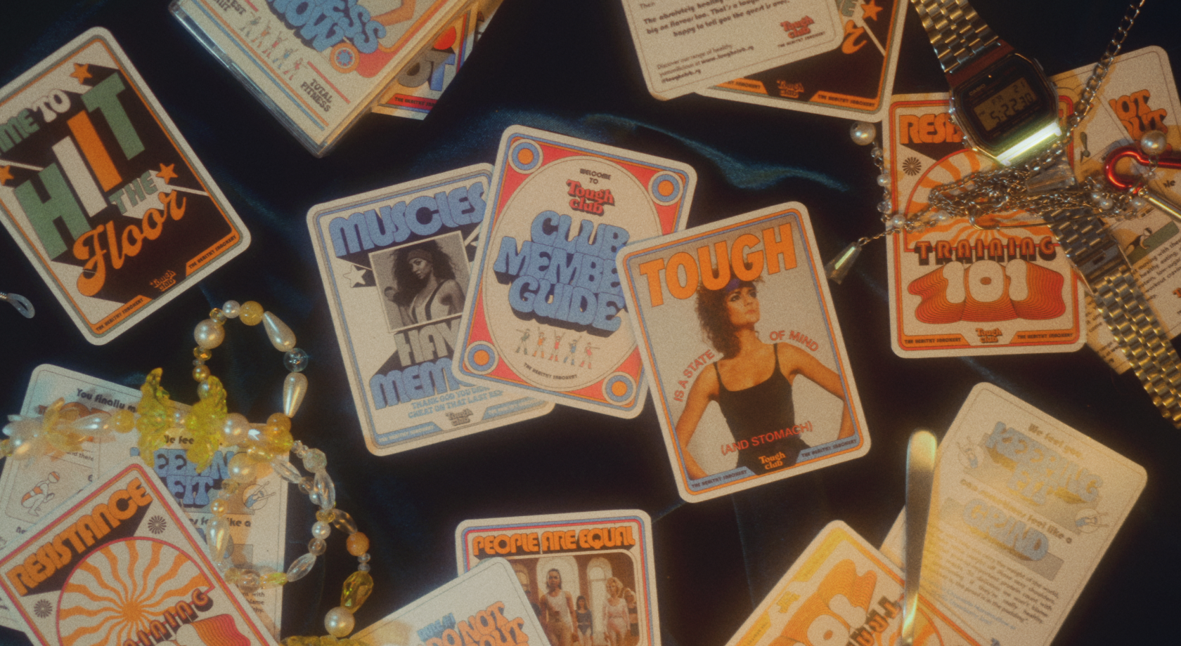
Since we were given free rein to go “craze-y”, we went full-on with the crazes of the ‘80s like card collecting and (more) neon, modelled after the card-chasing trends as a playful way to introduce fun facts about the products and as a light-hearted way to also introduce the Tough Club story.
Jazzercise
Inspired by their can-do spirit and popularity in the 80s, the Jazzercise Girls in various poses and moves are also introduced as secondary graphics to play up the brand’s positive spirit and energy.


