(Just in case you were still wondering, we’re really an independent design and advertising agency based in Singapore. Not a bakery.)
Aside from our design and advertising business, we used to run K+ Curatorial Space. Meant to be a showcase of art and design, K+ encompassed a gallery space, a retail space and a workshop space. Every month, K+ worked with different collaborators to present a changing line-up.
The Branding
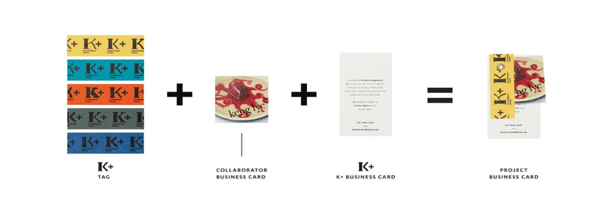
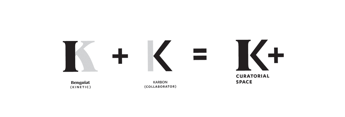
We wanted this new venture to retain something of us, with the “K” derived from Kinetic. It was then paired with a plus sign to signify collaboration.
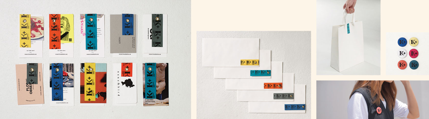
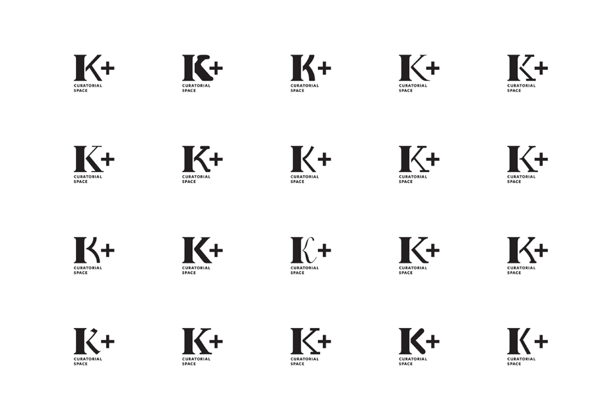
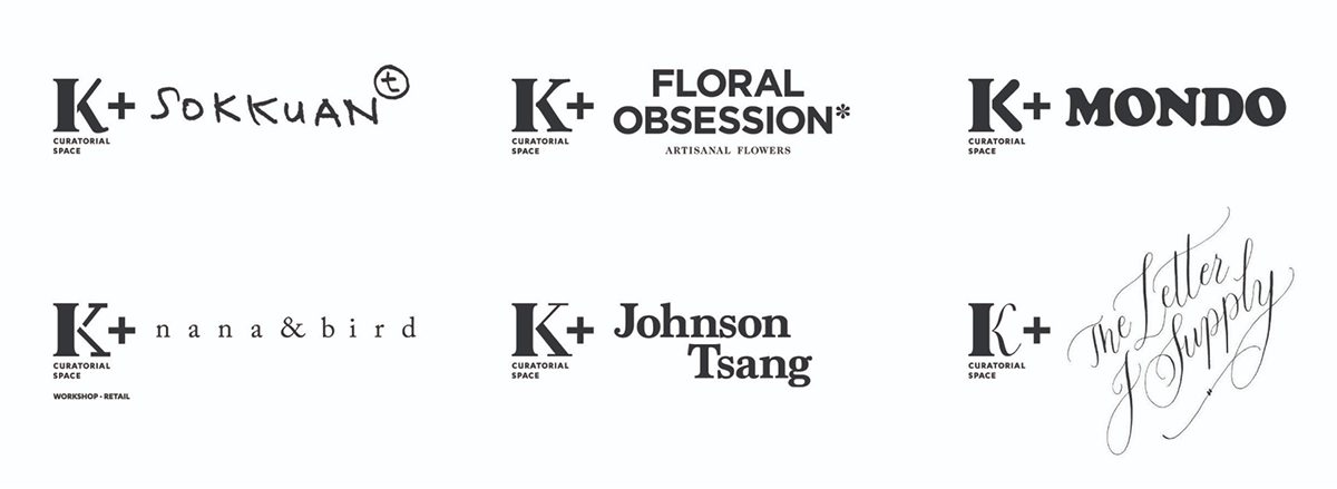
When “K+” is placed side by side with a collaborator’s name/logo, it clearly spells a joint effort. The same thoughtfulness is reflected in the typography of the K+ logo which consists of a varying element to better complement the individual styles of varied partners.
Rather than print the logo directly on business cards, stationery and such, we printed it on coloured tags. We then attached these to the collaterals using rivets. This coming together of different elements parallels the coming together of K+ and its collaborators.