The Exhibition Identity That Chronicles A Founding Father’s Life And Legacy
As Singapore marked 100 years since Lee Kuan Yew’s birth in 2024, Lucid Experiences set out to create an exhibition that would bring the founding father’s story to a new generation.
So when we were engaged to come up with the exhibition’s branding design, we conceptualised something that reflected the multifaceted spirit of both the experience and the visionary himself.
The main identity visual is crafted to reveal the many layers of Lee Kuan Yew. His unmistakable silhouette fan out in a spectrum, depicting the man from his youth to his later years in a contemporary manner that is aligned with the exhibition’s set design.
Typography
Similarly, we wanted to mirror the same sense of gradual storytelling encapsulated by the main graphic in the typography used. Hence, a unique logotype was created and treated in a way that goes from bold to lightweight and vice versa, literally showing Lee Kuan Yew’s legacy in motion.
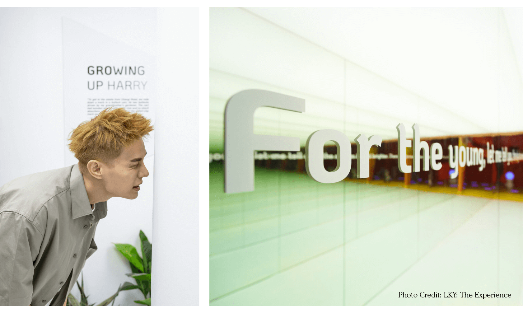
This typography treatment is also applied within the exhibition, through chapter introductions and quotes, to further elevate the overall experience.
Image Treatment
To complement the graphics and typography, we wanted the photos used to also include a different look that will capture visitors’ attention. So just like the modern, gradient effect used in the main visual, we added a layered gradient treatment to give those images a fresh touch.
Marketing Banners
To drive public attention to the exhibition, we also came up with marketing collaterals utilising our logotype and brand visuals in various formats, ensuring a cohesive yet exciting identity across print, digital, and environmental touchpoints.
Social
Outside the walls of the exhibition, we also came up with social content that translated the exhibition’s identity and talking points into bite-sized posts, ensuring that the lessons we can learn from this legendary figure lives on beyond the exhibition, and hopefully for years to come.