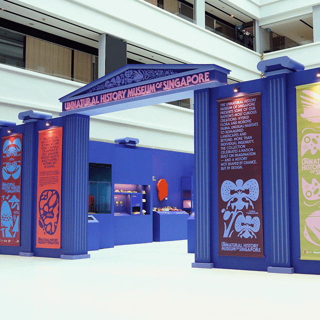
Singapore’s very first illustration festival saw us jumping in to help with the identity and launch comms. As a showcase of original and independent illustrators, what better way to promote the festival than by using their works?
Logo
We designed a logotype that is bold yet simple. This ensures that the logo does not detract from the focus of the event: the illustrators/illustrations. The font is so very slightly off-kilter, reflecting a festival that is much less staid compared to its arts counterparts.

Film & Print
To get the design scene in Singapore excited, our teaser film gave them a peek at the many illustrious illustrators invited for the event. Similarly for the posters, we crafted a template that made the illustrations the centrepiece.


