(Just in case you were still wondering, we’re really an independent design and advertising agency based in Singapore. Not a bakery.)
Believing that flowers help people express feelings they cannot capture in words, every creation at Floral Obsession is bespoke and as individual as its patrons. We wanted to create a brand identity that is just as thoughtful.
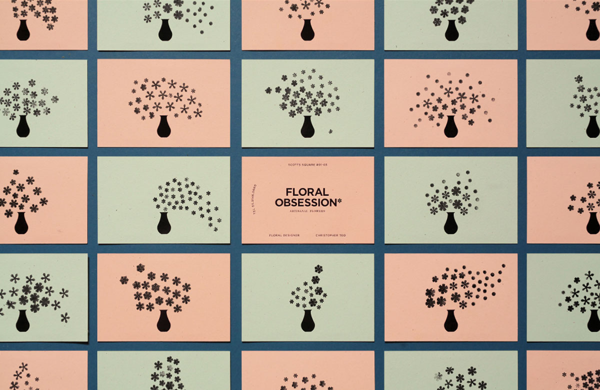
What design element could represent this idea of saying more? Our answer: the asterisk, which is used to say something more, like how we use flowers.
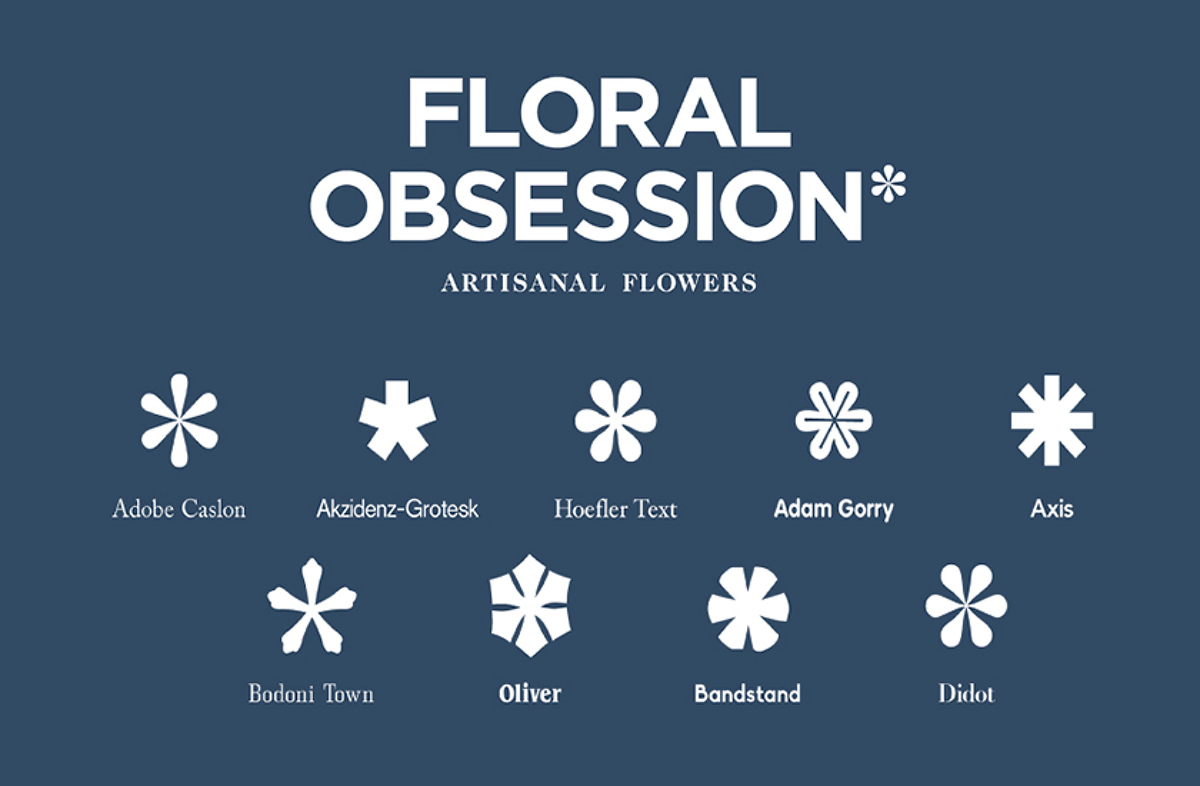
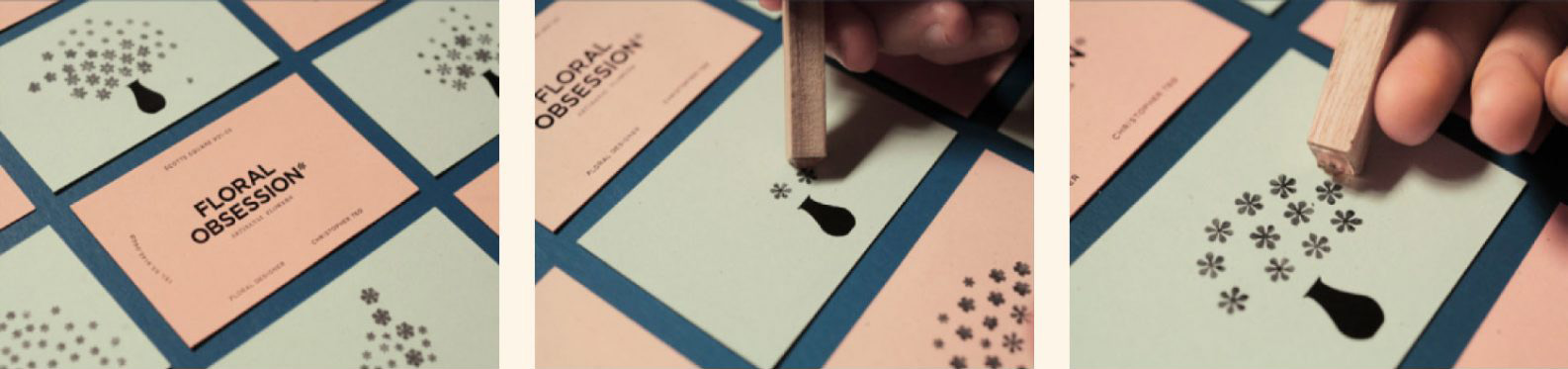
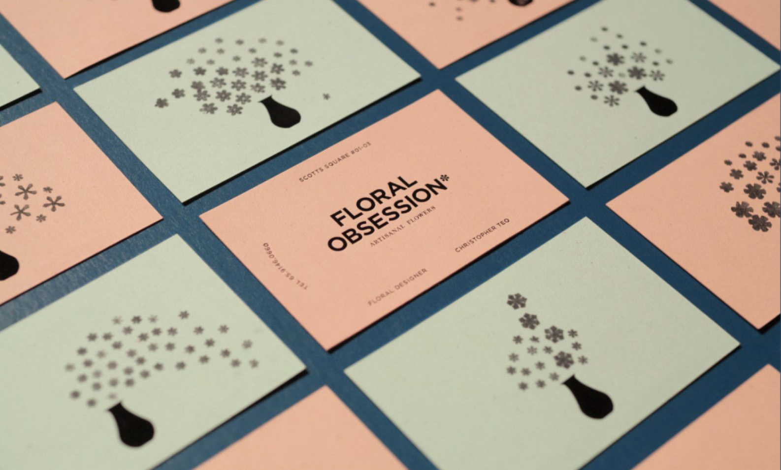
We gathered a bunch of asterisks from different typefaces, like different types of flowers, and used these in the design of the business card.
The front of the card is printed with all the necessary information, but the back is left blank except for a vase graphic. This allows the florist to create various floral designs using our set of asterisk stamps, reflecting the individuality of his actual floral arrangements.
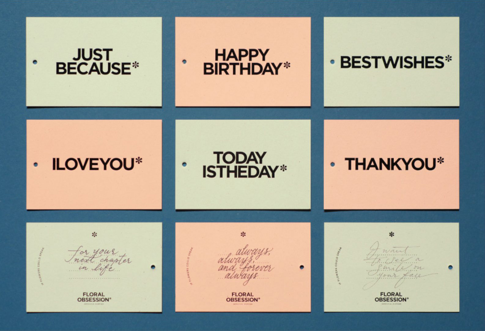
The same concept is extended to note cards with a short message printed on the front, and with space overleaf for the sender to say more.
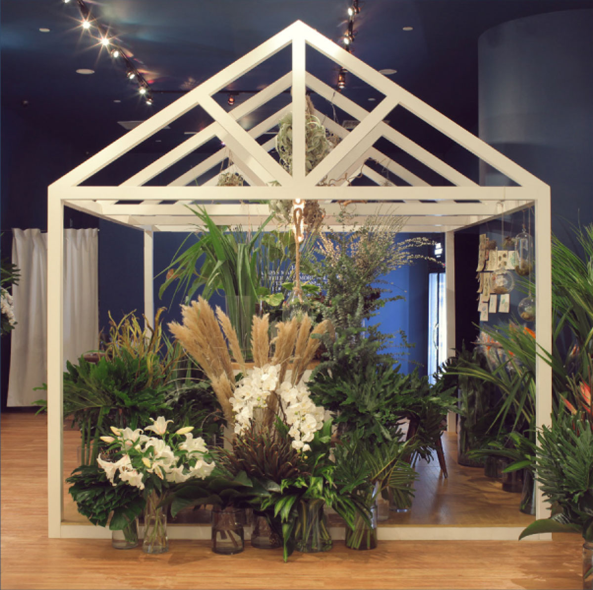
We also helped design the atelier space itself, creating an inviting atmosphere, bringing customers into the florist’s ‘home’ that overflows with flowers and greens.